
Arclight Labs
Information Architecture
Wireframing & Prototyping
UI & UX
How can the digital experience of an eSports brand in the Philippines connect to the gaming community in universities?
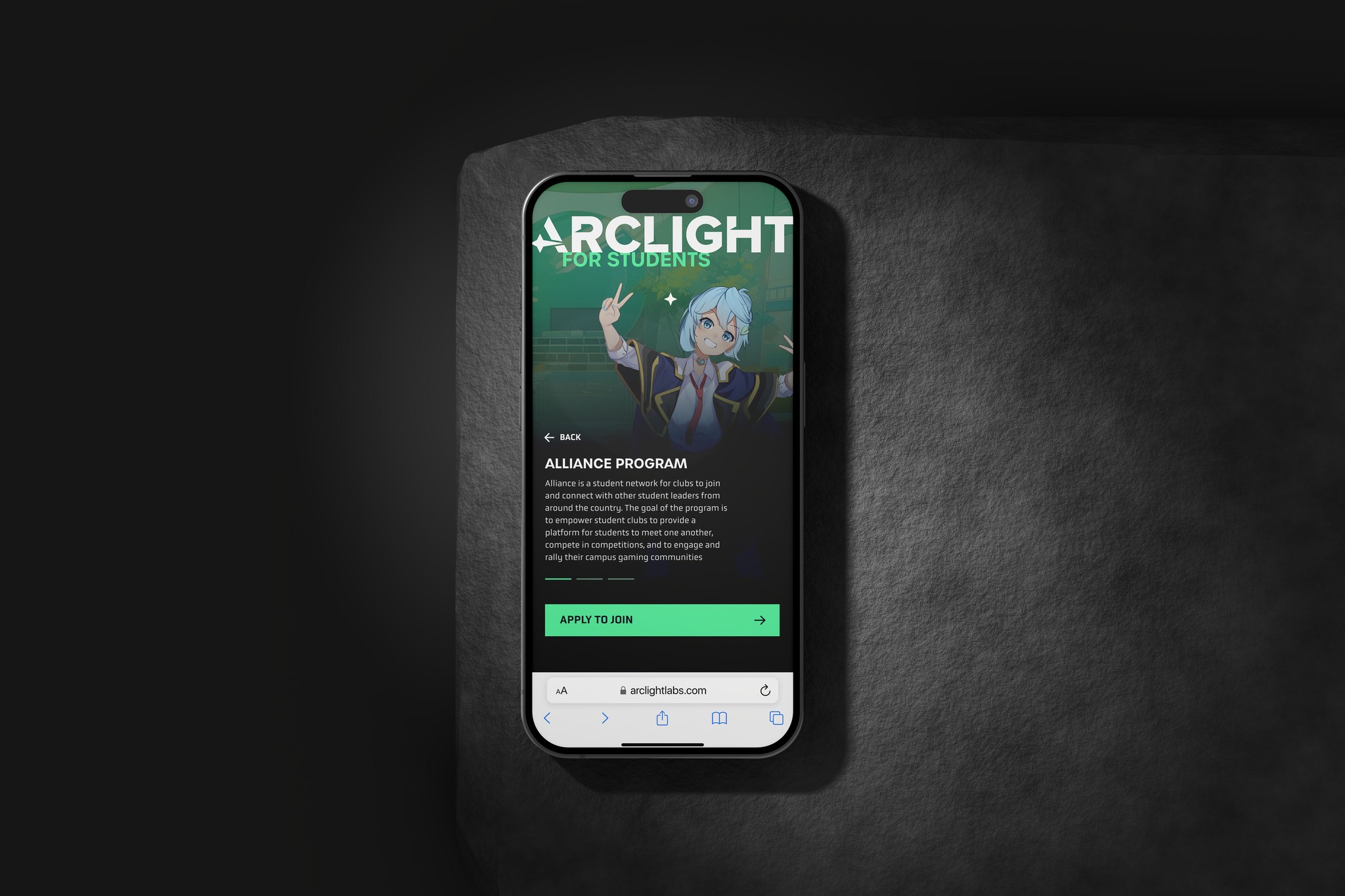
AcadArena, a specialist in eSports events and special projects in the asian gaming market, needed help when their rebranding gave birth to Arclight Labs, the branch responsible for providing student clubs with scholarships, infrastructure, and sponsorship for competing in professional competitions.
The process.
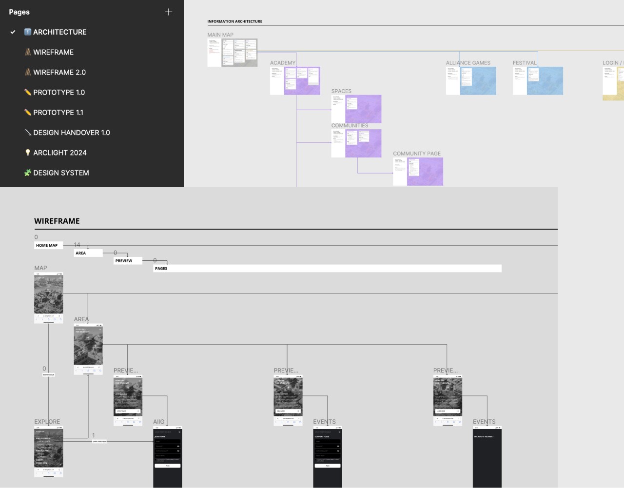
After a few rounds of interviews for understanding how to layout the information architecture and carefully craft the wireframes that served as a base for the whole website, I've built a prototype for challenging with the team whether we had arrived at the structure we wanted to.
A game-like experience.
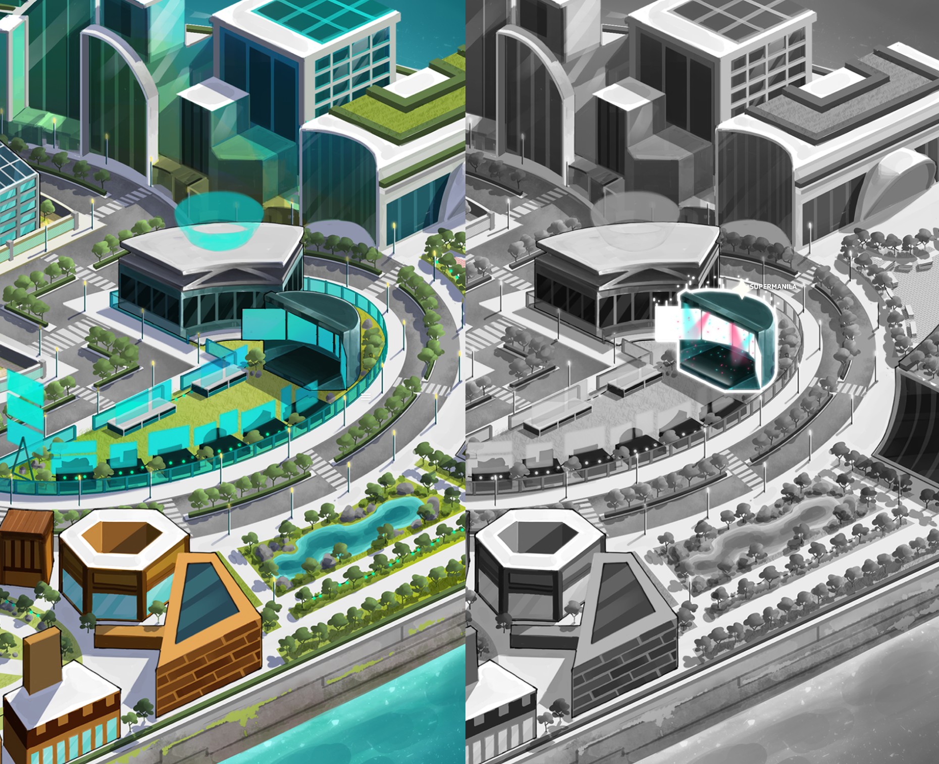
One of their requests from the beginning was that the whole page felt like an open map game. Much like those their audience is used to playing already and would feel comfortable navigating in.
Crafting the pages as spaces within the map and allowing for a free navigation was a challenge which proved to be an interesting approach while making it a unique experience contributing to their rebranding efforts.
A comprehensive design system.
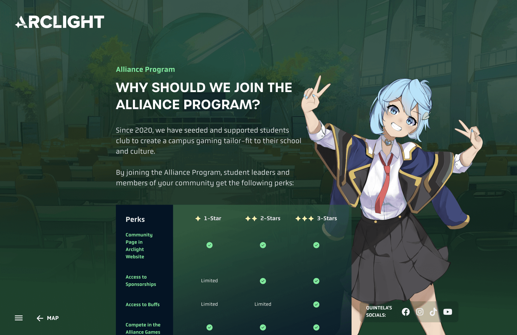
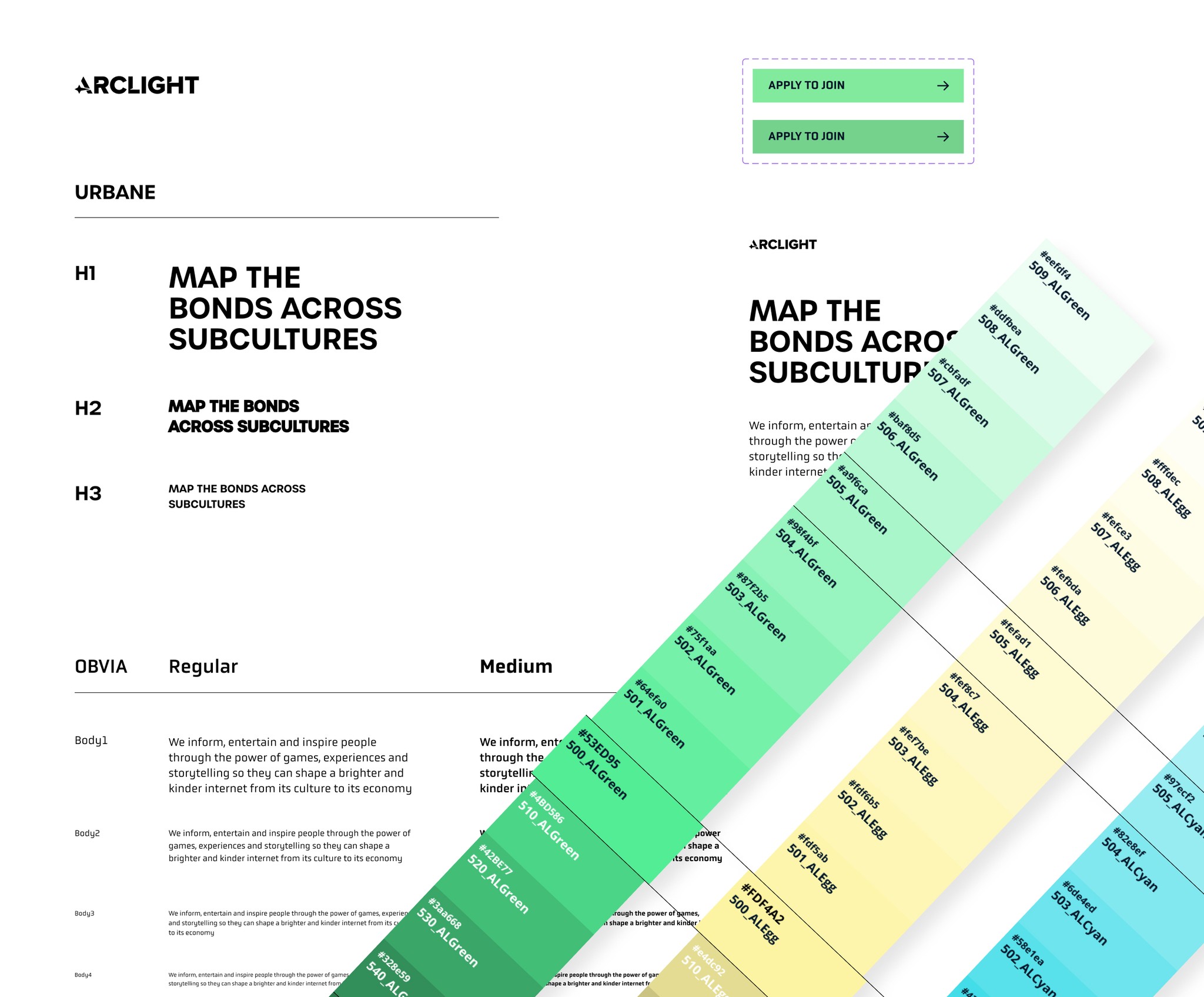
Making their website modular and easy to be updated was one of the main requests. So a design system and guidelines were provided so their internal team could have extreme agility when building further pages or screens to keep growing their digital environment.
How can the digital experience of an eSports brand in the Philippines connect to the gaming community in universities?
AcadArena, a specialist in eSports events and special projects in the asian gaming market, needed help when their rebranding gave birth to Arclight Labs, the branch responsible for providing student clubs with scholarships, infrastructure, and sponsorship for competing in professional competitions.



A game-like experience.
One of their requests from the beginning was that the whole page felt like an open map game. Much like those their audience is used to playing already and would feel comfortable navigating in.
Crafting the pages as spaces within the map and allowing for a free navigation was a challenge which proved to be an interesting approach while making it a unique experience contributing to their rebranding efforts.
The process.
After a few rounds of interviews for understanding how to layout the information architecture and carefully craft the wireframes that served as a base for the whole website, I've built a prototype for challenging with the team whether we had arrived at t








A comprehensive design system.
Making their website modular and easy to be updated was one of the main requests. So a design system and guidelines were provided so their internal team could have extreme agility when building further pages or screens to keep growing their digital environment.