
Kaia Health
Digital Product Design
Facilitation
What to do when patients don't stick to their therapy in the long run?
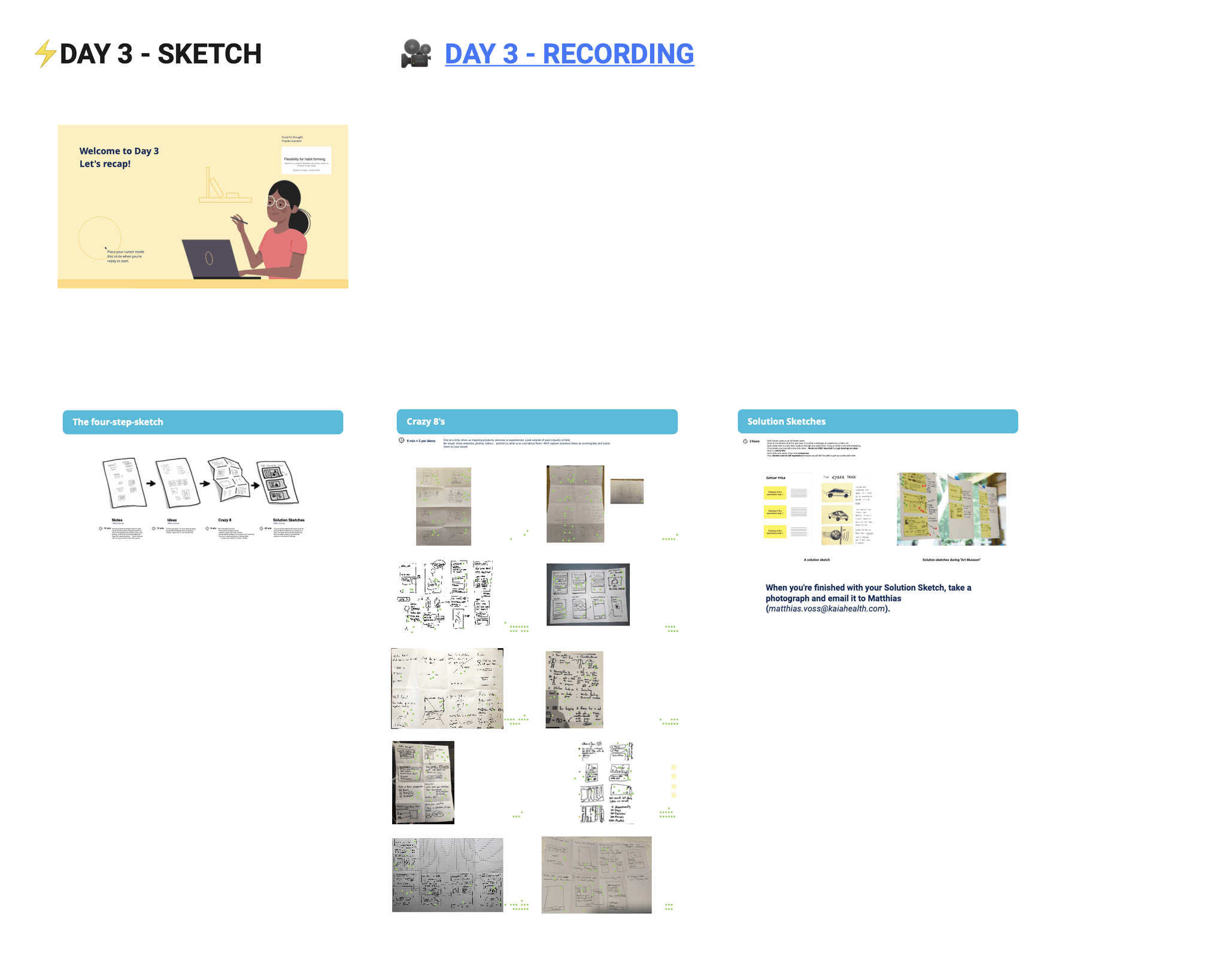
At Kaia, I've been in charge of facilitating the first Design Sprint in the company which led us to a whole new product roadmap for 2021/2022. As an outcome, I've been leading the design efforts in the Activation Team on a mission to get patients to start and stick to their therapy programs.
Creating Engaging Therapies.
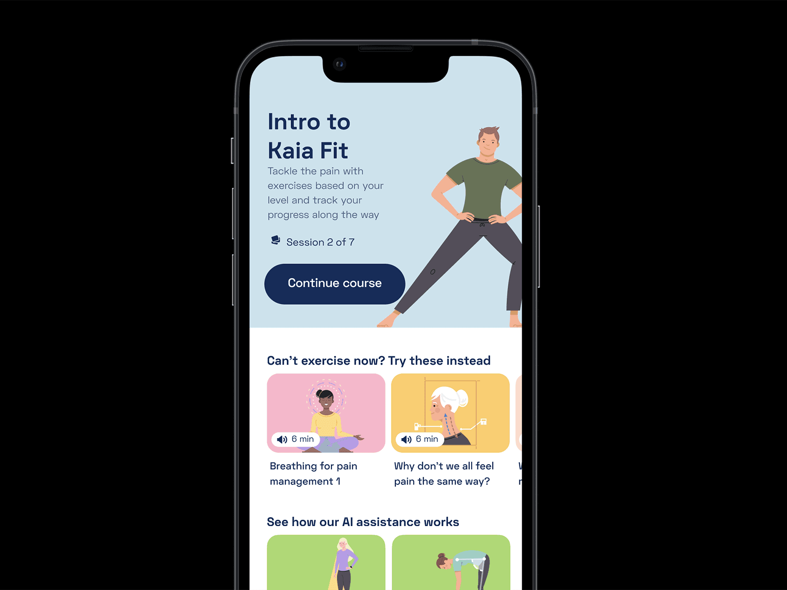
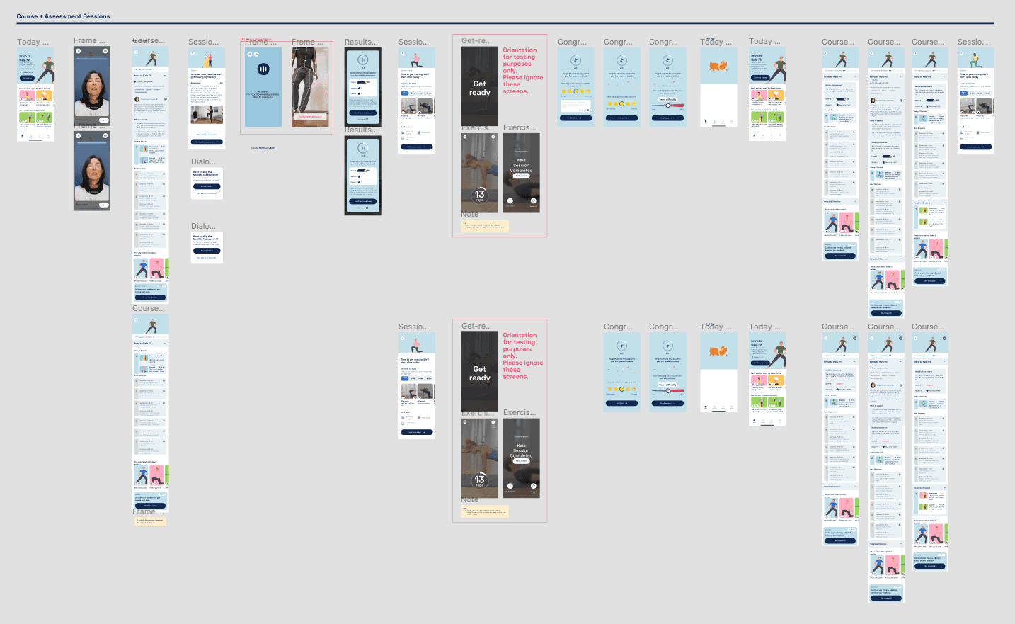
As part of our hypothesis generation, one that stood out was that "Courses and Assessments" could be a great way to get patients to experience Kaia's singular Motion Tracking technology.
The majority of chronic patients have the issue of not finding the motivation to stick to the practices their physiotherapists recommend.
More than half of chronic pain patients fail to follow the recommendations of their physicians at home.
Based on medical research in the field as well as within our own Kaia user base, it became known that above 51% of patients are not compliant with their recommended treatment.
That realization lead to the hypothesis that creating a sense of commitment and progress could lead to better patient retention and adherence in the long term.
Listening to their pain.
We had to figure out how long our patients were engaging in their current therapy recommendations. While assessing that in qualitative user interviews, the period of about 7 days showed as a common, where their motivations would last until the next flare-up could make them skeptical or demotivated to return to their exercise or mental health sessions.
Reward for adherence
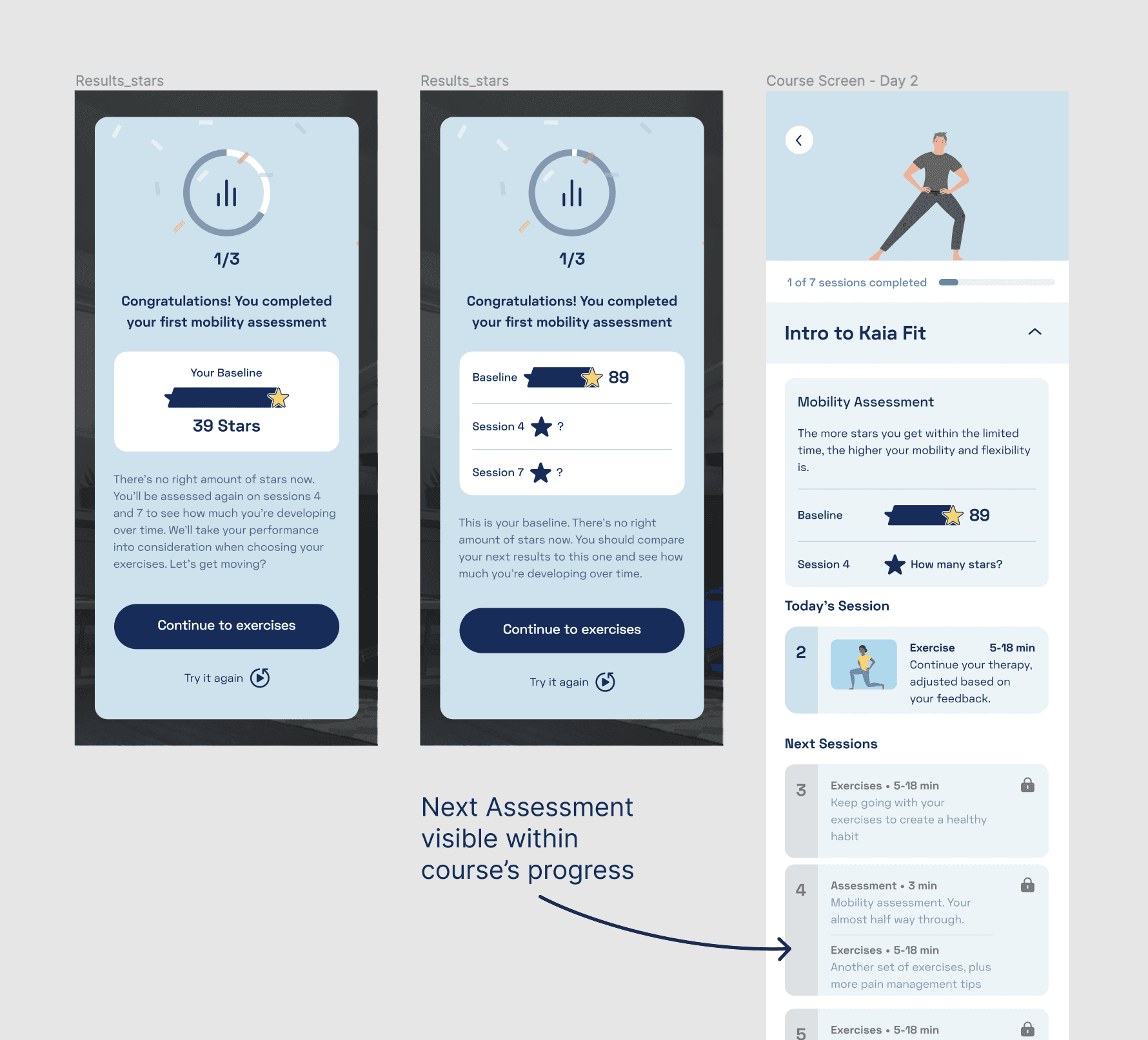
Our idea was to provide patients with recurring mobility assessments to capture their real improvements while also giving users a sense of reward which kept them motivated to continue following through with their therapy plans. These assessments would then show progress and comparison with their initial baseline.
Great learnings from testing.
In user testing we've noticed that the majority of patients who experienced the option of playing a mobility game as a form to assess their mobility and pain levels ended up curious about how their progress could look like in the future. Therefore putting expectations in trying their upcoming assessments to have the autonomy of self-measuring their progress and making sure their therapy was indeed working.
The not so great ones.
Some users questioned the validity of that simple mobility game as a medical diagnosis. Concerns made them quite skeptical that the information and numbers seen on the screen might not be relevant.
What were the outcomes?
Knowing that the Motion Tracking technology did have a positive effect in engaging patients both for it's capacity of assessing mobility but also as a non-standard, "high-tech" way of doing physical therapy, we've decided to pair the assessments approach with a in-person coaching follow-up which happened when users were assigned a 1x1 call with coaches to talk about their baseline and subsequent assessments. This way, we managed to cater for both the skeptical as well as the curious ones to indeed stick to their therapy and have better outcomes overall.
What to do when patients don't stick to their therapy in the long run?
At Kaia, I've been in charge of facilitating the first Design Sprint in the company which led us to a whole new product roadmap for 2021/2022. As an outcome, I've been leading the design efforts in the Activation Team on a mission to get patients to start and stick to their therapy programs.
More than half of chronic pain patients fail to follow the recommendations of their physicians at home.
Based on medical research in the field as well as within our own Kaia user base, it became known that above 51% of patients are not compliant with their recommended treatment.
That realization lead to the hypothesis that creating a sense of commitment and progress could lead to better patient retention and adherence in the long term.
Creating Engaging Therapies.
As part of our hypothesis generation, one that stood out was that "Courses and Assessments" could be a great way to get patients to experience Kaia's singular Motion Tracking technology.
The majority of chronic patients have the issue of not finding the motivation to stick to the practices their physiotherapists recommend.
Listening to their pain.
We had to figure out how long our patients were engaging in their current therapy recommendations. While assessing that in qualitative user interviews, the period of about 7 days showed as a common, where their motivations would last until the next flare-up could make them skeptical or demotivated to return to their exercise or mental health sessions.
Reward for adherence
Our idea was to provide patients with recurring mobility assessments to capture their real improvements while also giving users a sense of reward which kept them motivated to continue following through with their therapy plans. These assessments would then show progress and comparison with their initial baseline.
Great learnings from testing.
In user testing we've noticed that the majority of patients who experienced the option of playing a mobility game as a form to assess their mobility and pain levels ended up curious about how their progress could look like in the future. Therefore putting expectations in trying their upcoming assessments to have the autonomy of self-measuring their progress and making sure their therapy was indeed working.
The not so great ones.
Some users questioned the validity of that simple mobility game as a medical diagnosis. Concerns made them quite skeptical that the information and numbers seen on the screen might not be relevant.
What were the outcomes?
Knowing that the Motion Tracking technology did have a positive effect in engaging patients both for it's capacity of assessing mobility but also as a non-standard, "high-tech" way of doing physical therapy, we've decided to pair the assessments approach with a in-person coaching follow-up which happened when users were assigned a 1x1 call with coaches to talk about their baseline and subsequent assessments. This way, we managed to cater for both the skeptical as well as the curious ones to indeed stick to their therapy and have better outcomes overall.
